Selected work / Concept studies

Built to be remembered.

Three distinct brands. Three considered ways to connect identity, content, and digital presence.

Self initiated concepts, designed by CLTRD LABS. Business details, material claims, offers, and listing information are illustrative and would require confirmation before a real launch. These are design studies, not commissioned work or measured results.

01 / Coffee & community / Concept

Common Ground

Brand identity · Social · Web

Common Ground

Good coffee. Better company.
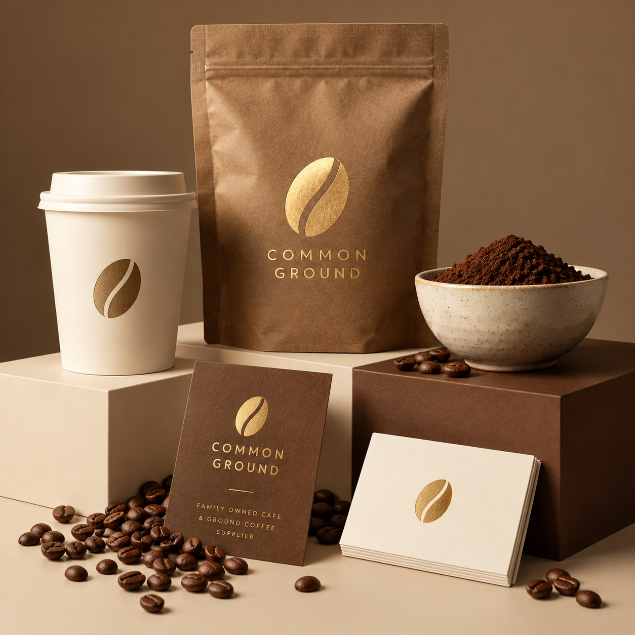
Ground coffee supplier packaging and wholesale conceptRETAIL + WHOLESALE
01 / Understand

What needed to change?

The starting point was a neighbourhood coffee brand with a warm in store experience, but no clear story connecting its coffee, house made menu, and community online. A feed focused only on products would miss what makes the place worth returning to.

For this concept, we framed the brand around everyday connection. That gives the identity and content a shared purpose: helping someone picture their own morning, catch up, or quiet moment at Common Ground.

02 / Define

What shaped the creative direction?

We kept the coffee palette and built the identity around a simple coffee bean symbol. Packaging, a fictional updated menu, and a coffee and pastry pairing campaign show how the cafe could communicate useful information with a recognisable visual rhythm.

The proposed content pillars are the menu, coffee supply, and family ownership. A Bristol location, founding year, and welcoming slogan give the fictional profile a clear sense of identity without using people or invented cafe photography.

03 / Create

How does the concept work together?

The Instagram profile introduces the cafe and its ground coffee supply offer. Three website concepts then give each audience a route forward: discover the brand, explore the menu, or learn about coffee for retail and wholesale. The same symbol, palette, and voice connect all three.

The proposed next step is to turn the content themes into a repeatable publishing plan, then review profile visits, menu clicks, and enquiries after launch. Those signals would guide refinement; they are not results claimed for this concept.

02 / Three website page concepts
••• commonground.example / home
Home / Coffee & community

Good coffee.
Better company.

Freshly brewed. Locally sourced. Made for the moments we share.

Explore the menu ↗
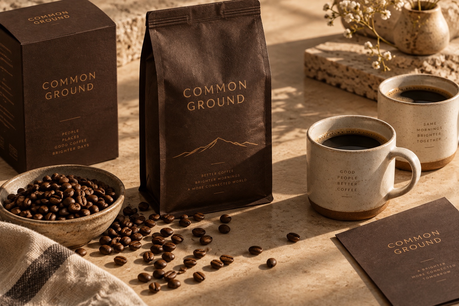
Original Common Ground bronze coffee packaging and ceramic cups

01 / Home page · Design concept

••• commonground.example / menu
Menu / Coffee & community

A little something
for every ritual.

Fresh pastries, slow breakfasts, and coffee worth making time for. Made here, best enjoyed together.

Take our coffee home ↗
House breakfastSourdough, eggs & seasonal greens
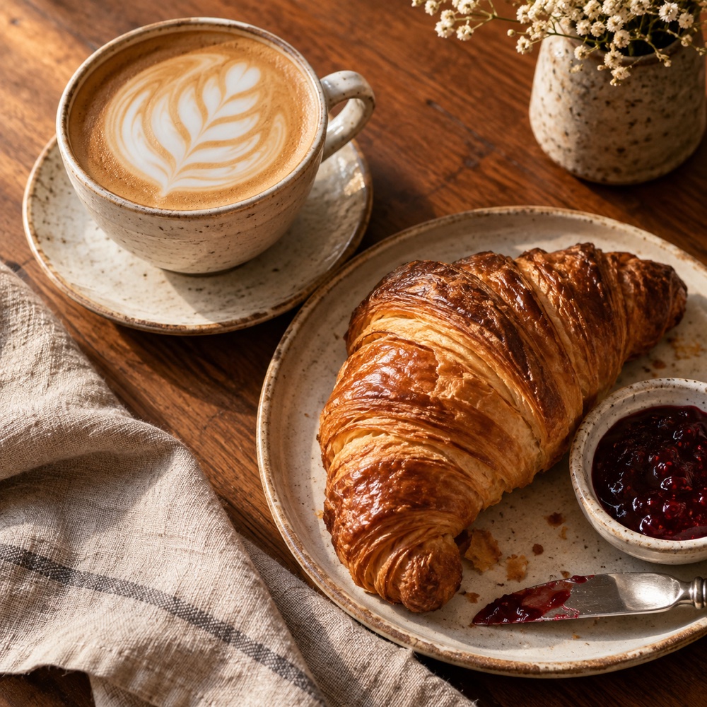
Latte and freshly baked croissant
COMMON GROUND / MORNINGS

The perfect
pairing.

Coffee & croissant · £6
Every day until 11am

Coffee & croissantThe morning pairing · Every day until 11am
Coffee grounds and Common Ground packaging conceptGROUND COFFEE
Coffee & pastryYour morning, made a little better

02 / Menu page · Design concept

••• commonground.example / coffee supply
Coffee supply / Coffee & community

Our coffee.
Your counter.

Freshly ground blends for your kitchen, cafe, or independent shop. Tell us how you brew and we will help you find your match.

Meet Common Ground ↗
Ground coffee supplier packaging and wholesale conceptRETAIL + WHOLESALE
Freshly ground · Retail bags · Wholesale supply

03 / Coffee supply page · Design concept

03 / The visual identity

The Common Ground palette

Espresso#231815
Cacao#4A2E27
Bronze#85431E
Roast#D39958
Cream#EACEAA

Design direction

A coffee bean symbol becomes a familiar signature on bags, cups, and the profile. Earthy browns and bronze keep the original warmth. Coffee packaging, an updated menu, and a family owned brand seal show both sides of the business: a neighbourhood cafe and a trusted coffee supplier.

Estimated timeline

4 to 6 weeks

Week 1: discovery and positioning. Week 2: identity and packaging direction. Weeks 3 and 4: content and website design. Weeks 5 and 6: refinement, build, and launch preparation.

Illustrative planning estimate, dependent on scope, approved content, and feedback.
02 / Coastal real estate / Concept

Still House

Brand identity · Social · Web

Still House

Helping growing families find room to belong.

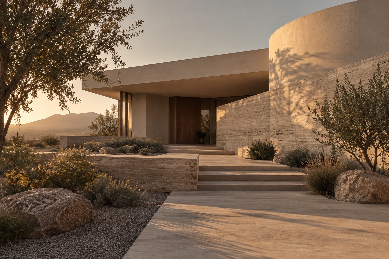
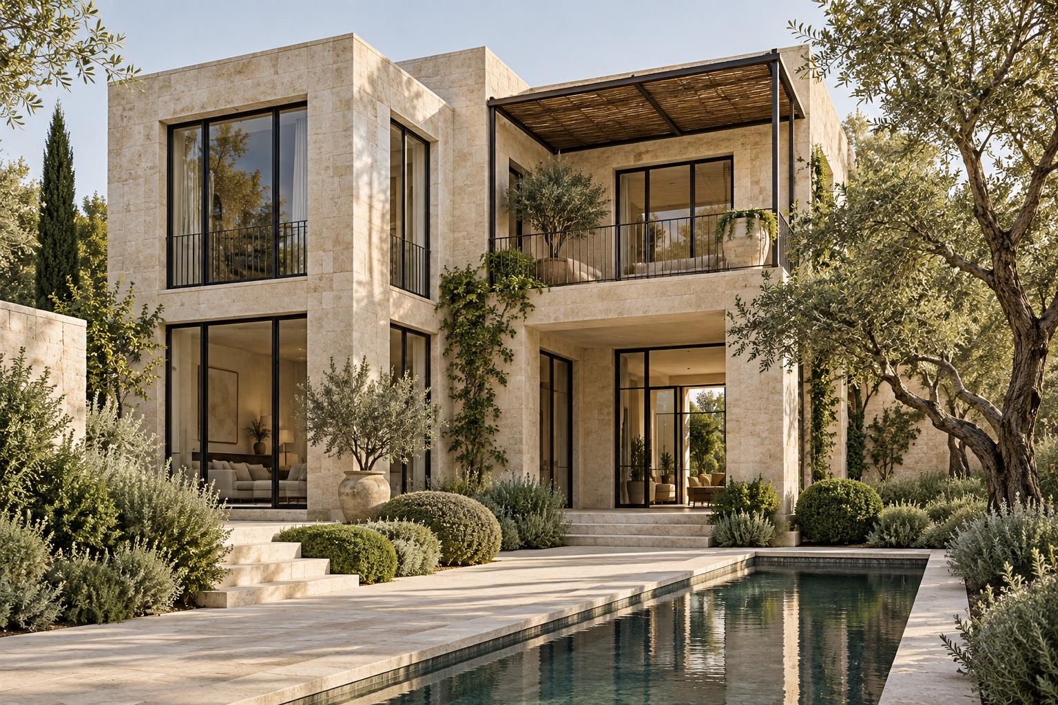
Contemporary stone residence in a conceptual property listing
PRIVATE VIEWINGThe Courtyard House3 bedrooms · 2 baths · R4.8m
STILL HOUSE / PROPERTY
01 / Understand

What needed to change?

Property buyers need more than an attractive image. They need to understand a home, trust the person presenting it, and know how to take the next step. This concept explores how an emerging property brand could communicate that reassurance without feeling cold or overly corporate.

The design brief centres on clarity: make the property the focus, give useful details a consistent place, and connect discovery on Instagram with a straightforward enquiry journey.

02 / Define

What shaped the creative direction?

Deep green, sage, stone, and white give Still House its own identity. Refined architectural imagery gives the homes presence, while editorial typography and clear listing details keep the presentation composed. An open viewing, a sold card, and a seasonal collection each introduce a different reason to engage.

The agency focuses on coastal family homes in Cape Town. Its content presents homes and selling services through architectural concept imagery, without artificial faces. The listing details are illustrative, demonstrating the information hierarchy and customer journey rather than offering real homes for sale.

03 / Create

How does the concept work together?

The Instagram listing system connects to three website concepts: an agency homepage, a properties page, and a page for sellers. The structure helps buyers compare homes and helps owners understand how their property would be marketed. Calls to action connect the journey from interest to a viewing or valuation.

For a live rollout, we would define a consistent listing template, confirm all property information, and connect enquiries to the sales team. Tracking viewing requests and enquiry quality would help assess whether the journey is supporting the business.

02 / Three website page concepts
••• stillhouse.example / home
Architectural concept of a contemporary stone residence
CONSIDERED HOMES / CAPE TOWN

A sense of place.
A place to belong.

Distinctive family homes. A thoughtful way forward.

Explore the collection ↗
ARCHITECTURAL CONCEPT / STILL HOUSE
THE STILL HOUSE APPROACH

Homes with character.
Guidance with care.

We connect growing families with considered coastal homes, bringing clarity to every step of the buying journey.

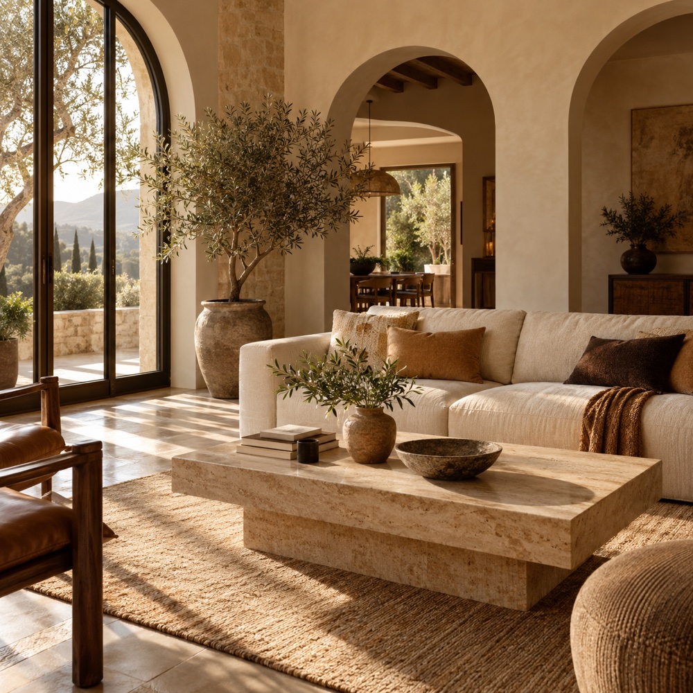
Sunlit interior concept with sculptural furnishings and natural stone

Selected residences

View collection ↗
The Courtyard House architectural concept
The Courtyard House

3 bedrooms · R4.8m

The Lightwell architectural concept
The Lightwell

3 bedrooms · R3.9m

01 / Home page · Design concept

••• stillhouse.example / properties
THE PROPERTY COLLECTION

Find the home
that feels like you.

Thoughtfully selected. Beautifully considered.

Coastal family homes3+ bedroomsCape Town
Courtyard residence architectural concept for a fictional property listing
FEATURED / OPEN VIEWING

The Lightwell

Generous living spaces arranged around a private courtyard, with natural finishes and room to grow.

R3,900,000
3 bedrooms2 bathrooms210 m²
Saturday · 11am to 2pm
The Courtyard House architectural concept
The Courtyard House

3 bedrooms · 2 baths · R4.8m

Spaces to make your own architectural concept
Spaces to make your own

Explore considered interiors

Illustrative listings and prices. Architectural concepts, not properties offered for sale.

02 / Properties page · Design concept

••• stillhouse.example / sell with us
SELL WITH STILL HOUSE

A considered sale
starts here.

Your home deserves more than a listing. We shape a clear story, a thoughtful presentation, and a focused route to the right buyer.

Discover our approach ↗
Interior concept illustrating a considered property presentation

From first conversation
to your next chapter.

01Understand

Your home, priorities, and timeline.

02Present

Positioning, imagery, and a clear listing.

03Connect

Focused marketing and qualified viewings.

LOCAL KNOWLEDGE. CONSIDERED DIRECTION.

Your next move,
with confidence.

03 / Sell with us page · Design concept

03 / The visual identity

The Still House palette

Forest#283F36
Sage#788878
Soft green#C8D0C3
Stone#F5F3ED
White#FFFFFF

Design direction

A roofline and paired doorway form the agency mark, suggesting a home and a clear way forward. Forest green conveys calm assurance and sage reflects the calm coastal setting. Architectural imagery, editorial layouts, and clear listing information bring warmth and substance to the concept. Generous spacing and restrained graphics keep the presentation calm and modern. Every post supports property discovery or a selling decision.

Estimated timeline

6 to 8 weeks

Weeks 1 and 2: audience research and agency positioning. Weeks 3 and 4: identity, listing structure, and social system. Weeks 5 and 6: website build. Weeks 7 and 8: content checks, enquiry testing, and launch preparation.

Illustrative planning estimate, dependent on scope, approved content, and feedback.
03 / Fine jewellery / Concept

Forme

Brand identity · Social · Web

Forme

Hallmarked gold. Authentic by design.

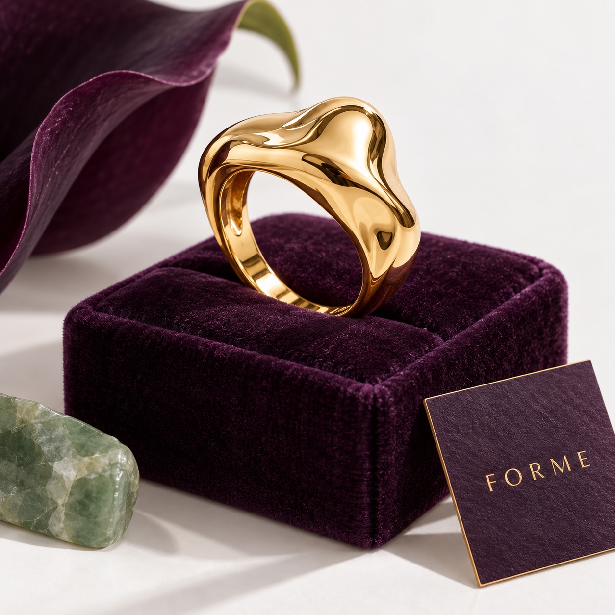
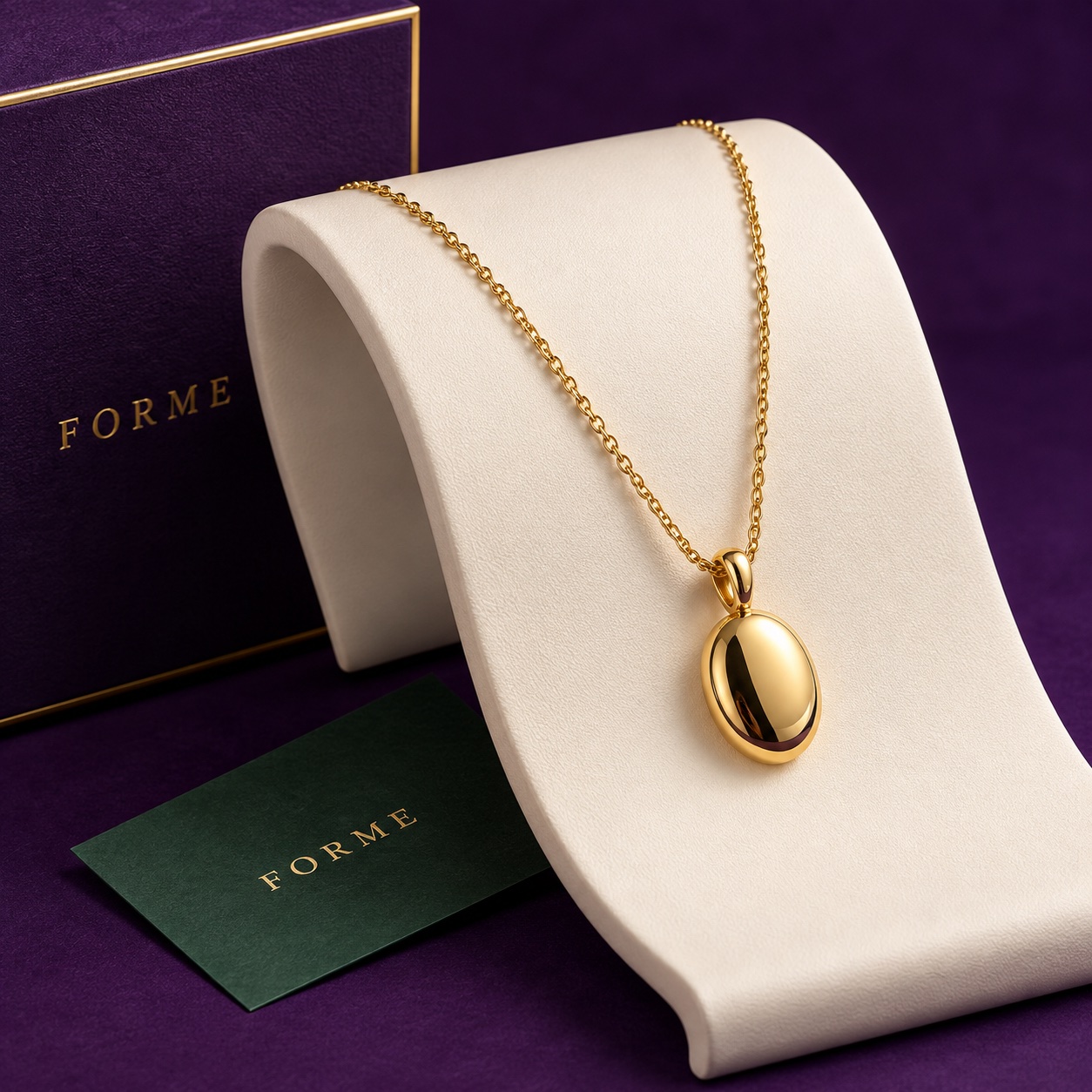
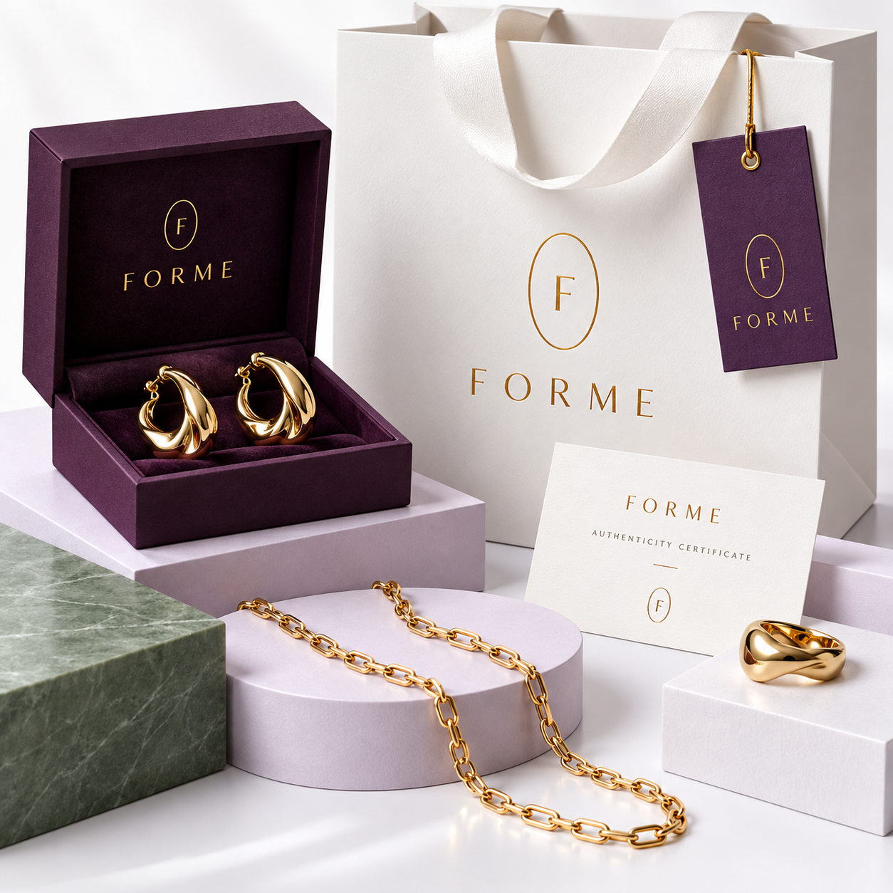
Purple and gold Forme packaging, jewellery and white brand collateral
01 / Understand

What needed to change?

A jewellery brand can have beautiful products and still struggle to communicate why someone should choose them. This concept starts with that gap: building a recognisable story around the pieces, rather than relying on isolated product shots.

We positioned Forme around everyday rituals and quietly expressive details. That focus gives the brand a consistent way to talk about its collection without making unsupported claims about materials, craftsmanship, or sourcing.

02 / Define

What shaped the creative direction?

Purple and gold anchor the proposed logo, labels, and packaging. White and pale lilac create space around the collection, with jade accents bringing complementary contrast. Jewellery illustrations and product mockups provide variety while keeping the brand and its objects central.

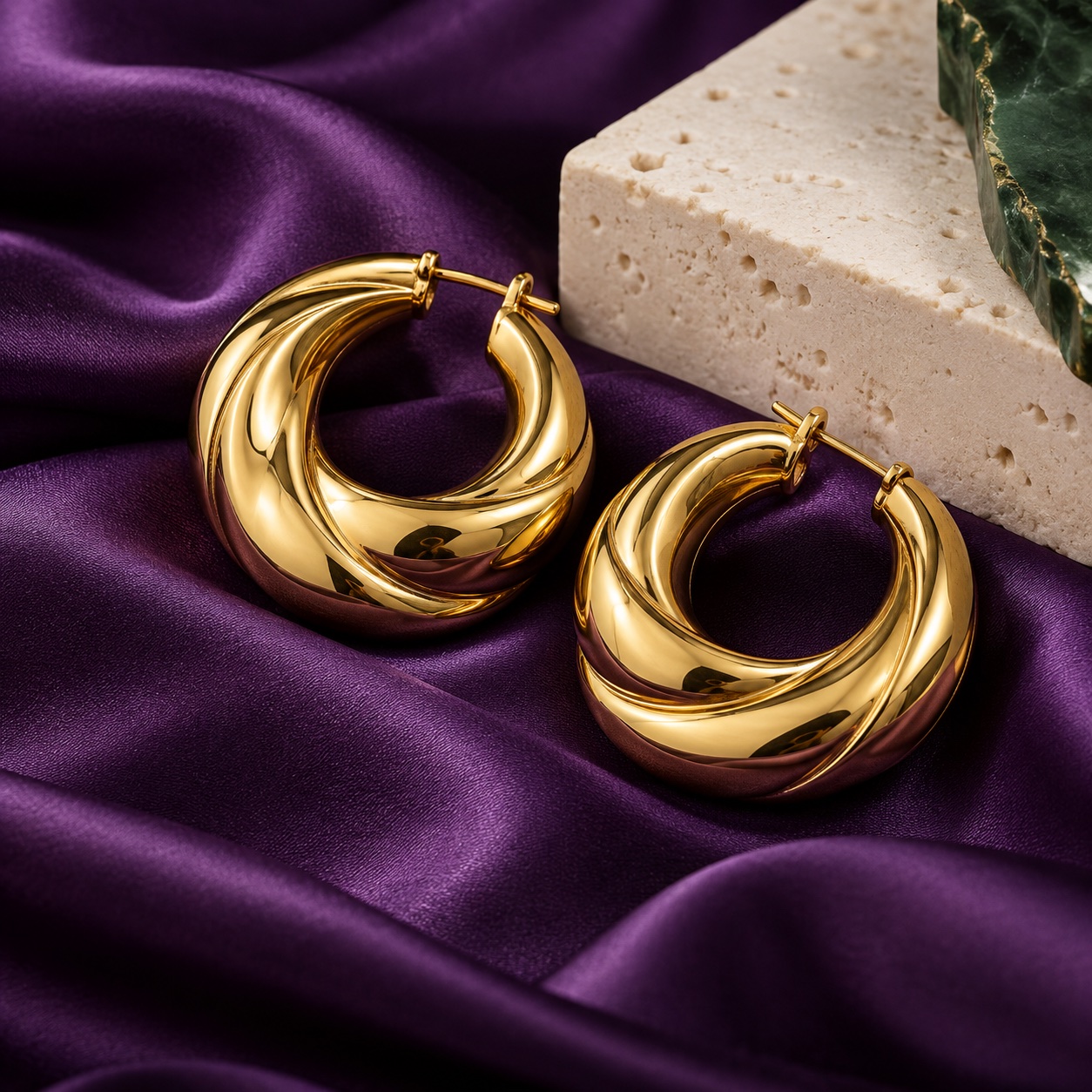
Realistic jewellery still lifes sit alongside the full packaging composition, a brand label, and a materials card. Rich purple fabric and gold details carry the identity, balanced by small areas of white and jade. The fictional London profile proposes 18k hallmarked gold; those material claims would be verified before a real launch.

03 / Create

How does the concept work together?

Three website concepts extend the identity into a homepage, collection page, and materials and craft page. Purple packaging remains a strong brand cue, while lighter page surfaces make product information easier to explore. Social posts and the website use consistent naming and visual details to support recognition.

Before a live launch, we would develop the product copy using verified details, map the collection pages, and plan the content calendar. Product page visits and purchase behaviour could then inform refinements; this concept does not represent a live store or measured sales results.

02 / Three website page concepts
••• forme.example / home
Home / Fine jewellery

Gold with presence.
Meaning that stays.

Discover sculptural 18k gold jewellery, imagined for everyday expression and the moments you keep.

Explore the collection ↗
THE CURVE / 18K GOLD

01 / Home page · Design concept

••• forme.example / collection
Collection / Fine jewellery

The forms
you return to.

Modern heirlooms in hallmarked 18k gold. Discover expressive shapes, thoughtful details, and your next signature.

Explore our craft ↗
THE ORBIT / 18K GOLD
THE CURVE / 18K GOLD
The Curve hoops18k gold · Sculptural essentials
THE ORBIT / 18K GOLD
The Orbit pendant18k gold · Everyday expression
THE SIGNATURE / 18K GOLD
The Signature ring18k gold · A personal keepsake

02 / Collection page · Design concept

••• forme.example / our craft
Our craft / Fine jewellery

The detail behind
every form.

Discover our approach to 18k gold, considered finishes, and jewellery designed to be worn and treasured.

Meet Forme ↗
FORMEGOLD WITH PRESENCE
18k gold · Authenticity · Materials & care

03 / Our craft page · Design concept

03 / The visual identity

The Forme palette

Royal plum#402451
Gold#C8A45D
White#FFFFFF
Lilac#EEE6F5
Jade#3F6F65

Design direction

A sculptural F monogram sits within a fine oval, like a hallmark. Purple and gold anchor the logo, packaging, and labels. White and lilac give the products breathing room, with jade accents adding complementary contrast. Product compositions, jewellery illustrations, and materials cards keep the collection central through a considered mix of graphic and product artwork.

Estimated timeline

5 to 7 weeks

Week 1: positioning and collection story. Weeks 2 and 3: identity and packaging direction. Weeks 4 and 5: product content and website design. Weeks 6 and 7: build, product information review, and launch preparation.

Illustrative planning estimate, dependent on scope, approved content, and feedback.
Good things start with a conversation

Ready for your own next chapter?

Let’s create a presence that makes your brand feel unmistakably yours.

Start Your Project